罗意威品牌档案·全收录
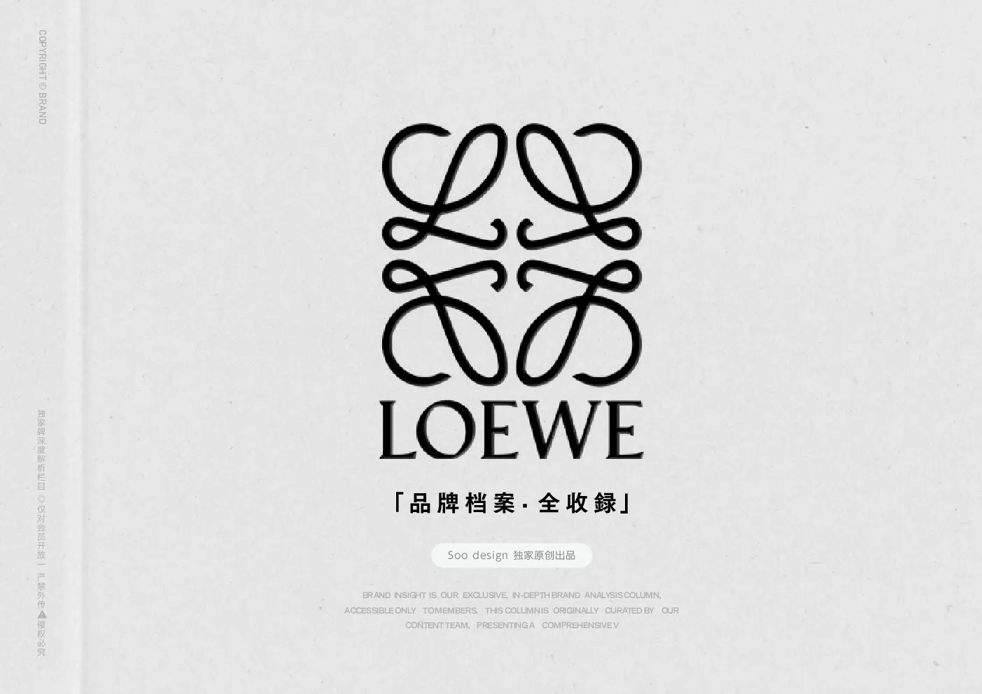
「 品 牌 档 案· 全 收 録 」 Soo design 独家原创出品 LOEWE 以“奢侈即工艺的诗学放大”重构消费体验—通过原始肌理、雕塑化视觉与留 白 剧 场 , 将 商 品 升 华 为 可 穿 戴 的 艺 术 史 片 段。本手册坚守“手的温度高于机器精度”的视觉信仰,在数字时代守护手工艺的神圣光晕。 * 本手册为 Soo design 会员私享栏目「原创品牌档案」 Soo design 独家原创出品Note: This manual is from the brand solution libraryExclusiveLoewe reconstructs the consumer experience with “the poetic amplification of luxury as craftsmanship”- through primitive texture, sculptural vision and white space theater, goods are sublimated intowearable fragments of art history. With “the future archaeology of craftsmanship” as its core concept,Loewe has created a luxury paradigm that fuses traditional skills with contemporary art, and hasreinvented the definition of luxury through visual alchemy - commodities are not possessed, but rather,are messengers of craftsmanship that travels through time and space. “A”BrandSolution Library “品牌视觉体系” 图形与字体语言 · 图形标志 历史传承与经典元素强化现代、文化感几何美学与简约风格 LOEWE的Logo是由4个大写的花体L组成,简洁明朗的线条、镜像对称的设计。Loewe经历过一次换Logo和新包装,原本繁复的衬线字体被微调。和旧logo相比,新的线条更趋于简洁,整体呈现出更多的空间感和时尚感,给这个经典老牌注入现代感和文化感。 Loewe's Logo Is Composed Of Four Capitalized Floral L's, With CleanAnd Clear Lines And Mirror Symmetry.loewe Has Gone Through A LogoChange And New Packaging, And The Original Complicated Serif FontHas Been Fine-Tuned. Compared With Ilogo, The New Lines Tend To BeMore Concise, And The Whole Presents More Space And Fashion Sense,Injecting A Sense Of Modernity And Culture Into This Classic Old Brand. 图形与字体语言 · 图形标志 LOEWE徽 标 由 西 班 牙 艺 术 家Vicente Vela于1970年 设 计,4个花体L字母排列成方形镜像图案。过去40年这一标识经过多次更新,目前的图案诞生于2014年,由现任创意总监JonathanAnderson联手法国设计公司M/M Paris设计,字体简洁现代。 Designed in 1970 by Spanish artist Vicente Vela, the LoeweAnagram logo features four floral L letters arranged in a squaremirrored pattern. The logo has been updated several times overthe past 40 years and the current graphic was created in 2014 bycurrent Creative Director Jonathan Anderson, in collaboration withFrench design firm M/M Paris, in a clean and modern typeface. 图形与字体语言 · 字体标志 新标识字体保留了传统衬线字体的一些特点,同时进行了现代化的简化和创新,如字母粗细变化明显,字母“O”的对称轴向左倾斜,字母“L”和“E”的下笔画具有独特的风格。它是由法国平面设计工作室M/M (Paris)设计,灵感源自Berthold Wolpe的字体风格 传承与创新的融合兼具现代感与优雅性更灵活适配 Loewe's new typeface identity is modern with clean, smooth linesand geometric shapes, unique and highly recognizable letterforms,elegant with graceful lines and proportions, flexible to be presentedin a variety of ways across multiple mediums, and innovative witha heritage that combines the brand's traditional elements withinnovative design techniques. 旧标识字体:旧标识字体是一种真正的复古字体,是衬线字体,带有传统的笔触风格,能明显看到经典的衬线,字母“W”的中间部分很复杂,字母有经典的比例和粗细变化,强调了品牌的传统和历史底蕴。 图形与字体语言 · 字体标志 传承与创新的融合兼具现代感与优雅性更灵活适配 新标识字体:2014年更新后的标识字体依然采用了衬线字体,保留了“传统”主题,字母粗细变化明显,具有独特的艺术感,比如字母“O”的对称轴向左倾斜,字母“L”和“E”的下笔画具有独特的风格,看起来既现代又有品牌传承的韵味。 The new Loewe logo, which has no existing equivalentin Western script, is based on German designer BertholdWolpe's typeface Pegasus. 该字体基于 Pegasus 进行设计调整创作 Design by M/M (Paris) LOEWE新品牌标识中的西文字体没有完全对应的现成字体,是基于德国设计师Berthold Wolpe的字体Pegasus进行设计创作的。 色彩与材质系统 · 材质宣言 LOEWE的产品在制作工艺上极为考究,像Puzzle系列手袋由多块皮革拼接而成,每一块的缝线都非常均匀细致。在广告中对皮革缝线进行超现实特写,是对其精湛工艺的展示,能让消费者清晰地看到品牌对细节的极致追求,体现出品牌的匠心精神。 放大工艺细节:缝线细节极致呈现 Loewe's products are crafted with the utmost care and attentionto detail, like the Puzzle handbags, which are made from multiplepieces of leather, with the stitching on each piece being very evenand meticulous. The surreal close-ups of the leather stitching inthe advertisements are a demonstration of Loewe's exquisitecraftsmanship, allowing consumers to clearly see the brand'sextreme pursuit of detail and reflecting the brand's spirit ofcraftsmanship. 色彩与材质系统 · 材质宣言 原始缺陷美学:编织纹理艺术表达 品牌注重材质工艺的创新表达,如采用拉绒麂皮等面料展现出丰富的质感和独特的触感。对于编织纹理进行超现实特写,能够将这种独特的材质工艺以艺术化的方式呈现,就像Loewe的Gate腰包采用编篮工艺,通过特写可以更好地展现其独特的编织纹理和工艺美感。 The brand focuses on innovative expressions of material craftsmanship, such asthe use of brushed suede and other fabrics to show the richness of texture andunique sense of touch. Surreal close-ups of woven textures can present this uniquematerial craftsmanship in an artistic way, as in the case of Loewe's Gate fanny pack,which uses basket weaving to better reveal its unique texture and craftsmanship. HEX#ffffffRGBR255,G255,B255CMYKC0,M0,Y0,K0 HEX#01e633RGBR1,G230,B51CMYKC65,M0,Y95,K0 Deep black HEX#000000RGBR0,G0,B0CMYKC0,M0,Y0,K100 图像系统 · 视觉摄影 艺术感与创意性突出产品质感时尚潮流感鲜明叙事性丰富 LOEWE品牌视觉摄影极具艺术感与创意性,常构建超现实场景、融入独特概念;极为注重突出产品质感,通过细节刻画与精妙光影运用,展现产品高品质;洋溢着时尚与潮流感,以个性模特造型、流行色彩风格引领时尚;还富有叙事性与故事性,构建情境、系列化表达,引发消费者情感共鸣,加深品牌印象。 LOEWE brand visual photography is very artistic and creative, often buildingsurreal scenes, into a unique concept; pay great attention to highlight thetexture of the product, through the details of the carving and subtle use of lightand shadow, to show the high quality of the product; overflowing with a senseof fashion and trend, with personalized model modeling, popular color styles tolead the fashion; but also rich in narrative and storytelling, to build a situation, aseries of expression, triggerin